interior for sensitive people
LOCATION
Moscow
area
68 m²

A fine line is the fragile edge of balance on which this interior is held. The balance of function and aesthetics. The history of this project is not about the complex architecture of the space and the long search for the ideal planning solution. It's about the "simplified" space that I entered to work on it, about creating history and matter in it.
How to do this in a space that is positioned by the developer — white box — "move in and live", where there seems to be no possibility for the movement of thought — the walls are placed, the electrics are laid, the scenario of life is "designed" in advance?
This is working with planes and volumes of objects in this space. The forms of furniture create the architecture of the interior in the absence of the architecture of the space itself. They are used to create zoning. They connect functional zones and they outline them. So the volume of the kitchen, which was initially not commensurate with the space, flows into the living room with the volume of the storage system, balancing the proportions. But at the same time, the kitchen is fenced off from the living room by an air rack. The sofa balances the mass of cabinets, it is light on legs, but its rich color does not allow the composition to "fall apart". Cabinets "grow out" of the wall plane, which is a color continuation of the compact entrance area. The rhythm of graphite doors against the background of light walls in the small hall leading from the living area to the private master room creates an enfilade in the space, structures it.
The color scheme of the project is based on natural colors, shades of the earth — sand, stone color, golden shades, deep graphite turning into a complex brown, the color of earth saturated with clay and copper, textures resembling a hewn stone surface, matte planes, wood. The customers of this interior are people who have a keen sense of life, art and aesthetics. For them, the house should be a continuation of this fine line between the ordinary and the beautiful. It should be like a second skin, a shell with which you merge.

GALLERY
A compact kitchen is an "incoming" condition from the developer, a "wet zone" reserved for it by an engineer. This space, as a cooking area, is generally enough for our scenario of life in the interior. This kitchen is ideal for breakfast, cooking light dinners and buffets. But visually, such a volume is not enough for the composition of the combined space with the living room. Therefore, in my project, the kitchen "flows" into the living room space due to the volume of the storage area — kitchen pencil cases with appliances. But it does not press, as it is a continuation of the color and shapes of the kitchen, moves from the plane of the wall, has a rhythm in its composition. The space of the living room and dining area has lightweight shapes, so I keep the air in the space, balancing between volumes.

GALLERY
Further down the hall we find ourselves in the daughter's room. This is a monochrome space for the creator. A space for thoughtful work, silence for the thoughts of a creative person. The depth in a compact space is created by an ascetic solution — nuanced color transitions, the movement of sunlight along planes. The storage system creates volumes in the interior, its facets "build" the space. Graphics and fonts that his mistress is interested in will fit well into this interior.

GALLERY
In the master bedroom, brutalism in the decoration is combined with the tenderness of color, the fragility of glass. The interior took place in its wisdom and silence, passion for life.
batrooms


GALLERY
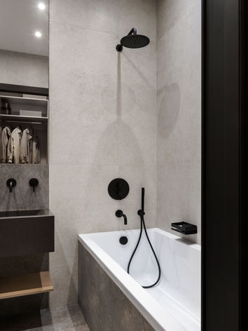
The bathroom is a continuation of the "silence" of the bedroom. Natural colors and textures are most pronounced here, they are darkened to create a greater depth of space. The planes of the walls and floor of the bathroom are solved by one material resembling the surface of sandstone. Only the niche of the shower is "heavier" in color, as a place of grounding. A combination, as if, of a chalky surface and a grey-earthen stone.
The whole interior is like a shot in an understated exposure. It is built on converging natural tones and shades. Like a day in cloudy Paris, when the sky is covered with clouds, but you have to squint from the sun penetrating through them.


